
What a Pencil Can Say About a Group
A graduate cohort chose the humble pencil as their emblem - and built an entire visual identity, symposium, and publication around it. Here's what that kind of thinking looks like in practice.
There is something quietly radical about choosing a pencil as your symbol. Not a logo, not a typeface, not a colour palette - a pencil. The kind of object that sits in a drawer, gets chewed, leaves marks, and gets passed around without ceremony. For one History of Design graduate cohort, it turned out to be exactly the right choice.
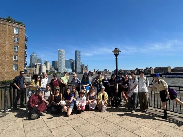
The group organised their own symposium and publication entirely from scratch, which meant every decision - the name, the visual language, the printed matter - had to come from them. When they went looking for an object that could carry the weight of a collective identity while still leaving room for 20-plus individual voices, the pencil kept coming back.
A Name Does a Lot of Work
The name Pencils Only arrived before much else did, and that order mattered. Once you have a name that means something, the rest of the design has somewhere to go. The pencil is democratic - everyone has used one, everyone understands it - but it also has specificity. It suggests drafting, revision, the mark that can be erased and made again. For a cohort studying the history of design, that felt right.
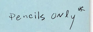
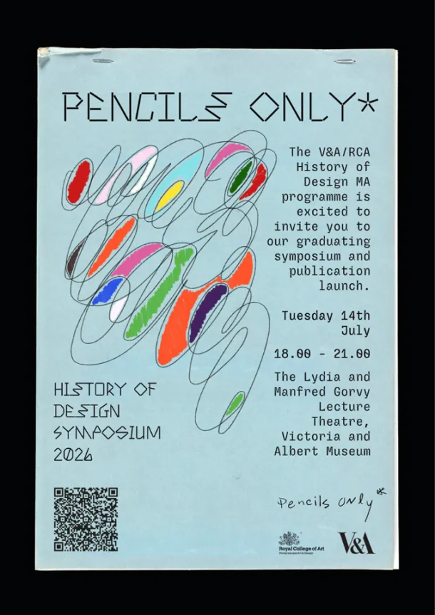
The symposium poster made the logic visible. Twelve students contributed samples of their own handwriting, and those were composed together into a single piece - different hands, one surface.
Balancing Individual and Collective
With more than 20 presentations across the evening, the visual identity had real work to do. It needed to hold everything together without flattening what made each contribution distinct. The handwriting approach solved that problem elegantly: every mark is recognisably human, but no two are the same. The result is a group identity that looks like a group actually made it, rather than a committee agreeing on something nobody loves.
The symposium itself took place in a formal lecture theatre, which could easily have made the whole thing feel like a standard academic event. But when the design thinking is this considered - when the name, the poster, the publication, and the emcee's role are all pulling in the same direction - the formality becomes a backdrop rather than a constraint. The pencil, it turns out, travels well.

Sienna is a visual artist and creative director from Chicago who lives for outfit inspiration. She crafts themed lookbooks and mood boards, helping readers translate abstract aesthetic trends into practical, wearable everyday ensembles.
All articles by Sienna Brooks
Comments (0)