
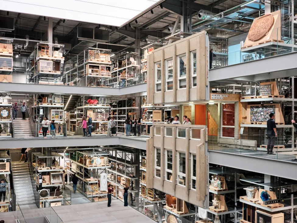
How Fieldwork Facility Rethought Museum Signage from Scratch
For V&A East, a Hackney studio designed a modular wayfinding system built to be dismantled, updated, and recycled. The details are worth a closer look.
Good signage is easy to overlook - which is, of course, the point. But at V&A East Museum, the wayfinding system designed by Hackney-based studio Fieldwork Facility rewards a second glance. It is quietly radical in the way it approaches something most institutions treat as fixed infrastructure.
Built to Come Apart
The system is modular at its core. Each sign can be disassembled, its components repurposed in different configurations, and when a section reaches the end of its useful life, the materials separate cleanly for recycling. This is not a cosmetic sustainability gesture - it changes the fundamental logic of how the signs are made and what happens to them over time. Institutions update their spaces constantly; a wayfinding system that can evolve without going to landfill is a genuinely useful thing.
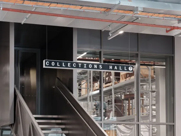
A Font Made for the Grid
The modular format created an unexpected typographic problem. Standard typefaces mix wide and narrow letterforms - an M and an I occupy very different amounts of space. In a tile-based grid, that variation makes text difficult to read. Rather than compromise, Fieldwork Facility commissioned Commercial Type to design a bespoke font, Spiller Mono, with letterforms of consistent width. The result holds together across the grid without the visual tension that comes from forcing conventional type into an unconventional system.
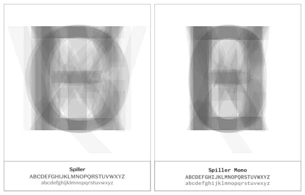
V&A East Storehouse and V&A East Museum share this underlying design approach but each site has its own material character, expressed through different low-carbon and recycled materials. The system is the same; the feeling is distinct. It is a good model for how considered design thinking - the kind that solves real problems rather than decorative ones - can quietly shape the way people move through and experience a space.

Ethan is a bespoke menswear consultant based in Toronto. He focuses on smart-casual dressing, proper garment fit, and blending timeless tailoring with contemporary street style accessories.
All articles by Ethan Blake


Comments (0)